Do you ever wonder why you feel a certain way in a particular room of the house? Little did you know, the colors in a room can set the tone for how you feel and can even urge hunger, relaxation, comfort and other feelings and emotions. The next time you’re choosing your paint colors and colorful elements of decor, think about the mood that you want to set. Colors have the power to generate various responses. If you’re looking to provoke a particular vibe for a certain room, read on to find out how to use color to create a desired mood in your home.
Kitchen Colors
Hues of red, orange, and yellow are perfect for the kitchen. You can sprinkle them throughout with decor and appliances of those colors or you can paint entire walls and cabinets. Red has long been recognized as a color that stimulates hunger. It’s perfect for the room in the home where eating is encouraged and enjoyed. Not only does red cause our stomachs to rumble, it also increases feeling of energy and passion. You don’t have to go all out and plaster your entire kitchen in red; start small and go from there. There are tons of appliances sold in stark reds to create a “pop” in the kitchen color scheme. Or, you can incorporate red into patterns on the walls, and even all the way down to the kitchen towels that you use.
The color yellow reminds us all of sunshine, positivity, and joy. Using this color in your kitchen coupled with other colored accents has the ability to bring an uplifting ambience to the room.
Yellow is also known to engage neurons in the brain for more focused thinking. That sounds like the perfect blend for a room that has so much hustle and bustle!
Orange is a playful color that can be incorporated into the kitchen for vibes of fun and security. Typically the color orange is associated with feeling safe and just like red, it makes us think about food. It’s advisable not to go overboard otherwise you’ll end up feeling like you’re in a construction zone.
When using such zesty colors in your kitchen, try to match them to the cabinetry and countertops. Don’t mix all the colors together or the kitchen will quickly turn into an eyesore. The kitchen is a welcoming area in the home and these colors are the perfect invitation.
Living Room/Family Room Colors
The living room and family room are the all-stars of family fun, comfort, and relaxation. To generate a sense of togetherness and warmth, use earthy tones like muted browns, creme or eggshell tones, and green. These colors create an atmosphere of relaxation, coziness, and rest. Try to stay away from tones that are too dark or you’ll end up with a heavier mood than you intended. Mix and match earthy tones with walls and decor in the living room. Decide on colors that will match without clashing with couch colors and lamp shades.
Use these colors to create an inviting space where the whole family can feel satisfied. As with the kitchen, you can add pops of red, yellow, and orange hues to bring some more liveliness into the space. Avoid completely painting a living room or family room in stark colors like red or orange or you’ll unintentionally create an overstimulating environment.
Dining Room Colors
Dining rooms are usually reserved for special occasions or dinners and a feeling elegance is what most people want to present. If you want to exhibit a sense wealth, luxury, and royalty, use darker shades of purples, browns, and black. These colors represent strength, power, and affluence but go easy on using these darker shades or the room will appear much smaller and gloomier. To arrange a classy yet uplifting space for dining, try mixing and matching these darker hues with lighter colors to create contrast and order. Don’t paint the entire dining room in one of these darker colors or the opulent mood will turn sour.
Bathroom Colors
A general rule of thumb for bathroom colors, is that bright colors like yellow, orange, or any neon should be completely avoided. Instead, opt for lighter colors that exude a mood of calmness, relaxation, and cleanliness. Shades of blue, especially lighter hues, give off a unique “cooling” effect. Mix different shades of blue with white and it’ll really amp up the feeling of serenity. If you use gray, stick to lighter shades . Too many dark shades in the bathroom and the calming effect will quickly be reversed. The bathroom is where we get ready and make sure we look and feel good so it’s important to choose colors that will help us feel more confident, airy, and light. To achieve that perfect mood of relaxation stick with the lighter colors, or mix and match with slightly darker tones. You can even feel free to throw in pale pinks in the form of candles or flowers to add cheerfulness to an already restful space.
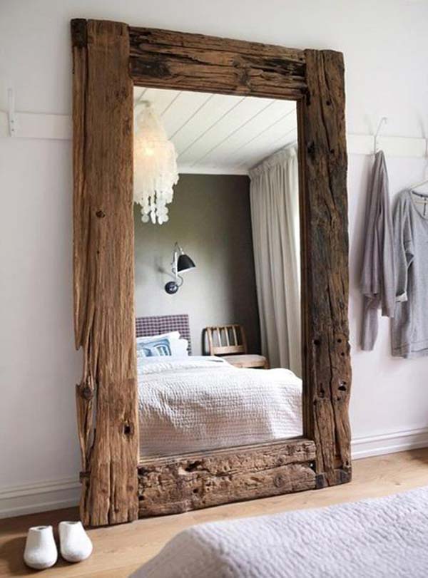
Bedroom Colors
There’s nothing quite like retreating to your bedroom for rest, relaxation, and enjoyment. Choosing a color for your room should cater to your own style because it’s not a space that everyone will always be using. Almost any color can work in a bedroom if it’s to your liking but even so a bit of prudence can help you keep things balanced. The mood of a bedroom is a combination of all the rooms in the house; tranquility, fun, warmth, and security. To establish a merger of all these moods, mix and match different colors like pink, blues, grays, darker colors, and splashes of white. You can do so by integrating these hues into furnishings, decor, wall art, and bedding. If you are a cheery person looking to express that in your bedroom, a vibrant color like kelly green, described here on House Tipster’s site, or sky blue would be appropriate.
Your bedroom should be your place of solace, and there’s no direct stringent color laws that need to be followed. Choose the colors that you like, the ones that make you feel happy, and colors that help you relax.