
If you want a living room that’s worthy of showing up in a home décor magazine, you need to start with a good color scheme. It’s not all about the color you choose for the wall. You want a look that’s well-balanced throughout the space, paying careful attention to how colors in the furniture, floors, walls, and artwork all complement each other.
7 Living Room Color Schemes Sure to Brighten Your Mood
It’s all too common to err on the side of caution, sticking with a neutral color scheme that just comes off as boring. On the other hand, you don’t necessarily want to make decisions that are so bold that they make others cringe.
We’ve put together a short list of some of the best color schemes for your living room. As you look through the images, you’ll quickly see how incorporating a few key colors can set the tone you want. Whether you’re looking for a tranquil space for relaxing or something happy and energizing, you’re sure to find a few ideas that will work for you.
1. Colorful Balance
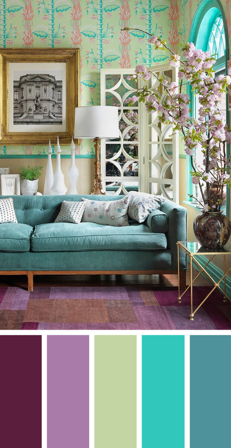

Those who like color in their rooms will love this look. It nicely incorporates different shades of purples and blues for a look that feels complete. Here, a colorful wallpaper adds a lot of visual interest to the space. What really makes this work, though, is the blue trim around the windows. It matches the blue of the wallpaper so that everything feels like it belongs together. Note that when you use a lot of color on the walls and floors, you need to balance that out with accents that are more neutral, like the white pillows and lampshade in this room.
2. Neutral Isn’t Boring


Grays and blues are generally thought of as neutral colors, but you can see here that they don’t have to be boring. A large rug covers the dark-colored hardwood floors, giving the space an airy feel. With a light background on the walls, you need the slightly darker color of the sofa for balance. Turquoise accents have the same calming effects of other blues but are a bit unusual. Though it’s hard to know whether this was an intentional choice or not, it’s interesting to note that the roaring orange of the fire burning in the fireplace is on the opposite side of the color wheel from the turquoise. It looks nice together.
3. The Pop of Color


Liking a bold color such as deep magenta doesn’t necessarily mean that you need to stick with bright colors throughout the space. In this color scheme, there’s a background of cool blue that allows the bright color to pop out at you. An especially nice touch here is the conscious color choice for the picture frames and table legs. The gold looks different than the usual black or brown frames you might see, and really stands out against the light blue walls.
4. Coastal Elegance for a Soothing Vacation


This living room feels like an extended summer vacation: the range of harmonious tonal blues on the walls, curtains, and couch are refreshing and relaxing. The neutral linen shades of the rug, table, and couches go with the flow and provide a soft backdrop to the blues. Golden wicker chairs and an accent mirror warm up the tranquil colors and keep them from becoming overwhelming.
5. Warm Reflections on a Golden Afternoon


Warm and welcoming, this monochromatic gold-toned room invites guests to sit for a spell and enjoy some good old-fashioned conversation. The lightest gold tone is on the walls, giving the room an open and airy feel. The striped rug incorporates several gold tones of caramel, topaz, and wheat, pulling the room together. Two plush chairs in espresso brown, a warm neutral, anchor the room and keep the gold tones from being monotonous.
6. Sand and Sea Glass Comfortable Beach Style


Sandy tones of light beige make this beachy living room exude comfort. Notice how the carpet, walls, couch, and coffee table are all tones of the same color, creating a soft harmony. Contrasting sea green and white elements are added in the form of throw pillows and wall art set upon a decorative ledge. A gray pillow and picture frame lend a soothing calm to the room.
7. Roses in the Cool Twilight


Intimate. Hopeful. Serene. These words come to mind when you see this living room. The walls, floor, and rug are soothing shades of gray and the couch is a deep twilight blue, accented by a lighter-toned fur throw. Pink throw pillows and flowers break up the grays and blues so that they do not overwhelm. Gleaming white side tables add a focal point. Black and white photographs pepper the walls with personality.
8. Uptown Princess, Fashion Icon

This deliciously sophisticated living room is done up in Neapolitan ice cream colors of chocolate, vanilla, and strawberry. The tones of chocolate and beige on the walls add a sense of coziness; pink pillows and a gold table and lamp bring glamour to the room. The leopard print pillows are actually considered neutrals, which will complement almost any color scheme. A stark black and white painting lends an edgy contrast.
9. Timeless Celadon: Elegance and Zen


There are few color combinations more elegant and serene than celadon and espresso. In this living room, the monochromatic tones of both colors instill a gentle yet stimulating energy. The celadon chairs and light celadon walls contrast delightfully with the espresso coffee table. A neutral beige carpet grounds the room, while floral satin pillows add visual interest. A variegated brown vase and side chair lend an earthy vibe.
10. Harvest Spice and Everything Nice


Enjoy rich autumn colors all year round! Deep orange and gold are analogous colors, or colors that harmonize because they are next to each other on the color wheel. To increase the feeling of harmony, two monochromatic shades of orange and orange/brown are included in the pillows and rug. A sofa and love seat in a neutral tan give the eyes a break from the strong saturated colors, adding balance to the room.
11. Sophisticated Comfort Old Hollywood Style

Pale shades of blue, linen, and white grace this living room in an elegant tribute to Old Hollywood. The secret to Old Hollywood style is in the luxurious details: tufted furniture with nail head trim, velvet pillows, mirrored end tables, a white shag rug, and metallic accents. But how to keep a pale living room from feeling too chilly and formal? Warm it up with a rich espresso floor and fawn walls.
12. Shades of City Tranquility


A sanctuary from bustling city life, this urban living area is a perfect example of how monochromatic colors bring harmony to a room. The color palette is very simple: an ivory carpet and couch, taupe tables and walls, and purple accessories. However, the three different shades of purple shown in the throw pillows, art, drapes, and lamps “finish” the room, turning it into a more complex and harmonious space.
13. The Earth and Sky in Harmony


This cheerful living room uses a bold palette of brown, turquoise, and white, recalling the earth and sky. Lighter monochromatic tones of brown and turquoise create a sense of harmony. Different shades of brown on the walls and floor provide a relaxing warmth, while the turquoise accessories and striped curtains give the room a pop of color and drama. The slipcovered white couch is casual and comfortable, adding balance.
14. Coffee with Cream on a Rainy Day


Curl up with a steaming cup of coffee or tea and a novel in this soothing contemporary family room. The palette is composed of cool neutrals—monochromatic browns, cream, and gray. The rich brown sectional sofa is accented with cream and gray-patterned throw pillows. A plush tan carpet warms up the floor. Light gray wall paint pulls the coordinating gray elements from the patterned pillows and lends a calming influence.
15. Defining Space with the Accent Wall


In an open concept living area like this one, it can be difficult to define the space. You’ll see that it isn’t a problem when you choose to paint the accent wall in a nice, dark color. The hardwood floors in this home really stand out, so the owner has incorporated that color into the overall plan for the color scheme. Since the floor and the accent wall are dark, they need to be balanced out with a large, light-colored sofa and throw rug to complete the look.
16. Bold Colors from Art


One of the best ways to find a color scheme that works for you is to start with a favorite piece of art. Here, the bright color of the girl’s dress might seem like an unusual choice, but it really works nicely when paired with the other colors. The magenta is on the opposite side of the color wheel, so it offers a sharp contrast to the bright greenish-gold color in the curtains. The dark blue-gray around the windows might seem too dark in other spaces but mellows out the bright colors in this room.
17. A Calming Sea of Blues


If you want a nice, relaxing space, stick with light colors like these. While everything is pastel, painting the trim on the ceiling a slightly different shade helps the eye stay interested. The blues are subtle, found throughout the space in little details, like the lamp, the coffee table centerpiece, and the pillows. Using these colors against a neutral background is perfect because it makes it easy to change the look when you want to. Rather than re-painting everything, you simply need to change the accent pieces.
18. Pretty with Pink


When you have too much pastel pink in your home, it can start to feel like the home of a little old lady. Using the light pinks alongside the cool grays that you see here gives the room a more sophisticated feel. The darker gray seen in the pillows offers a nice visual contrast, ensuring that the other colors in the space don’t get washed out.